The client played himself
Most clients want a film about what they sell. This one let us invent a mystery about their own mascot, gave us the run of the building, and then performed every part in it themselves.
What this was for
To show what happens when a client hands over the story instead of the brief — and is willing to be the cast, the location and the punchline.
The story, as we wrote it at the time
Most jobs, the client asks for a film about their business. This one, the client let us make a comedy series about them — and then played themselves in it.
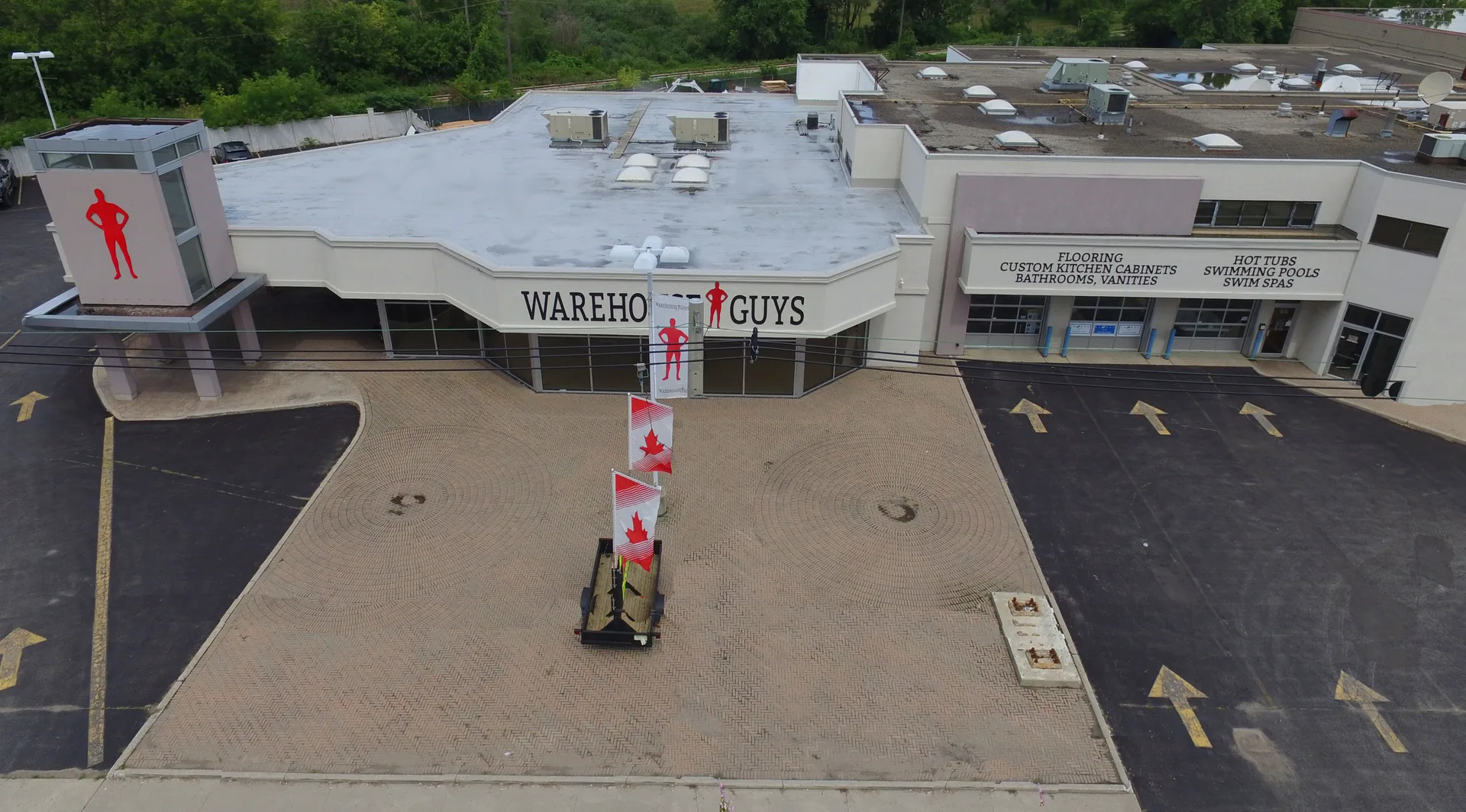
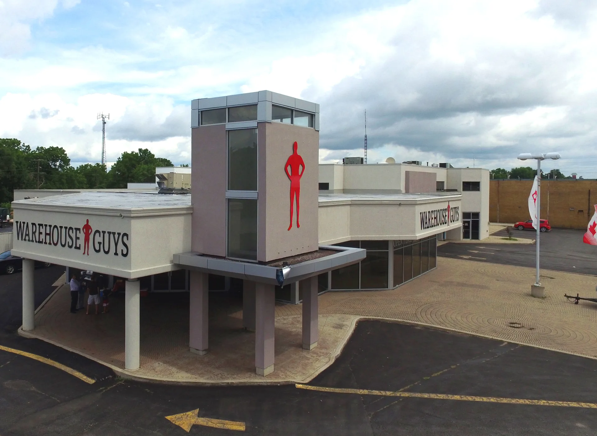
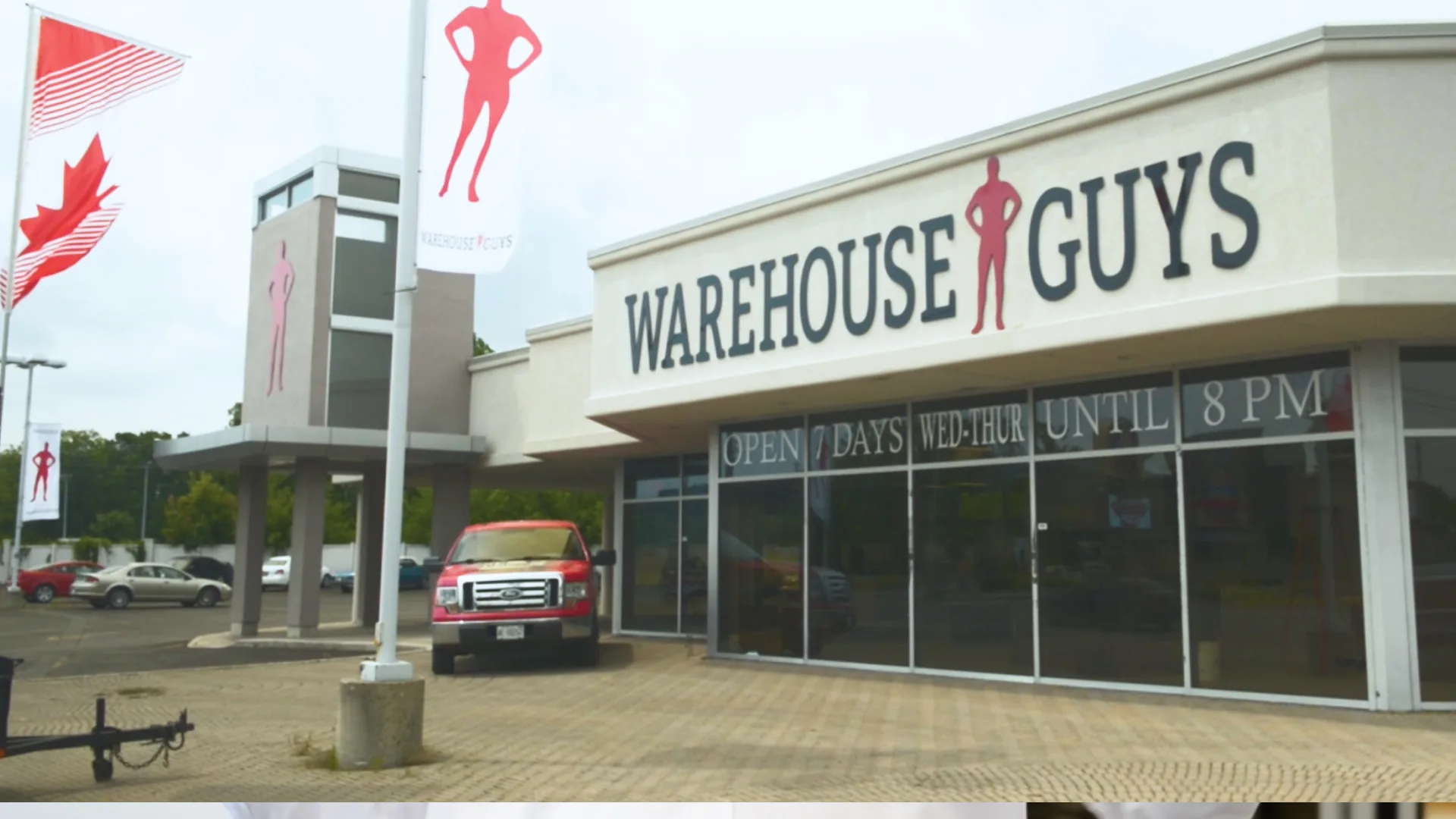
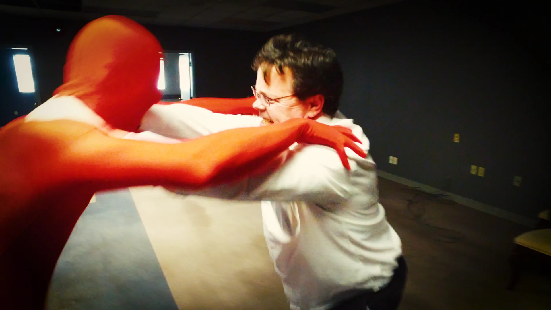
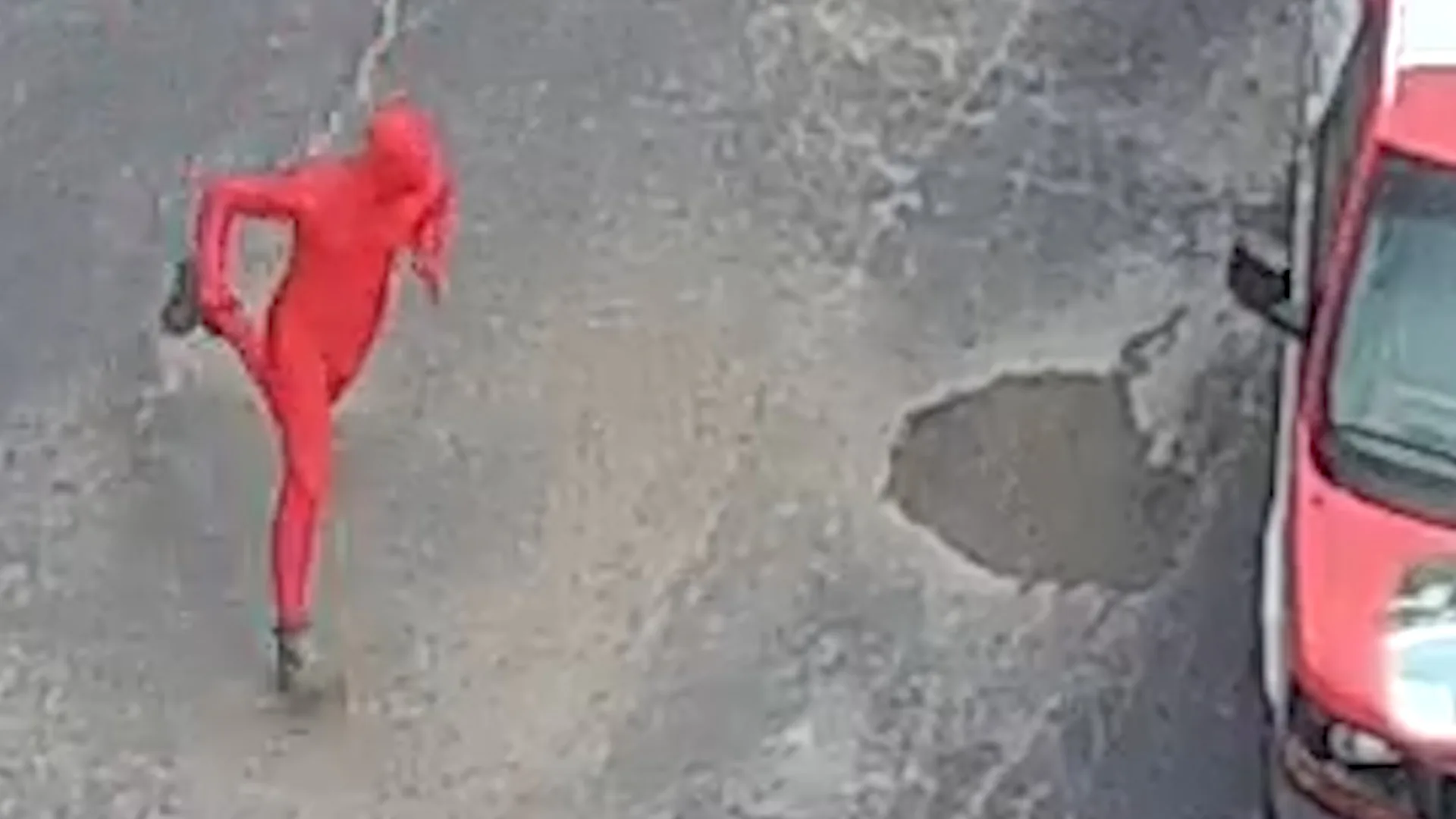
The Warehouse Guys is a local retailer: flooring, kitchens, bathrooms, hot tubs, pools and swim spas, all under one roof, with a big red silhouette of a man painted on the side of the building — their mascot. The premise we built the show on was that the mascot had come to life, was letting himself into the building at night, and was quietly cutting their prices behind the owners' backs.
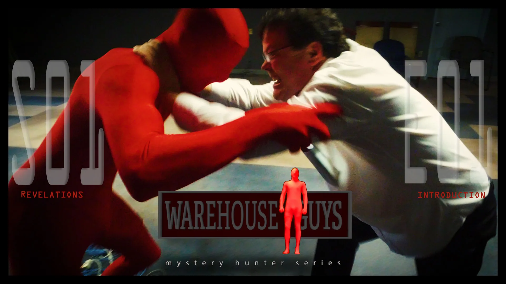
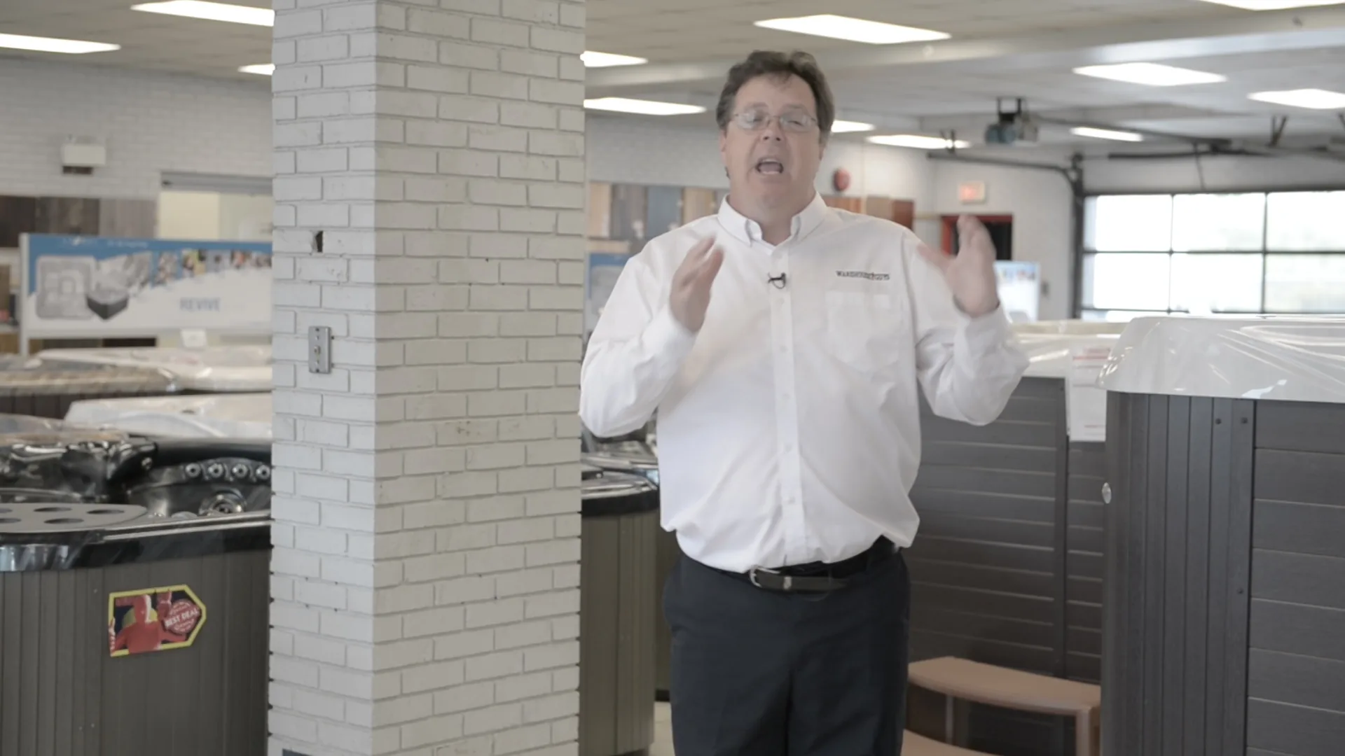
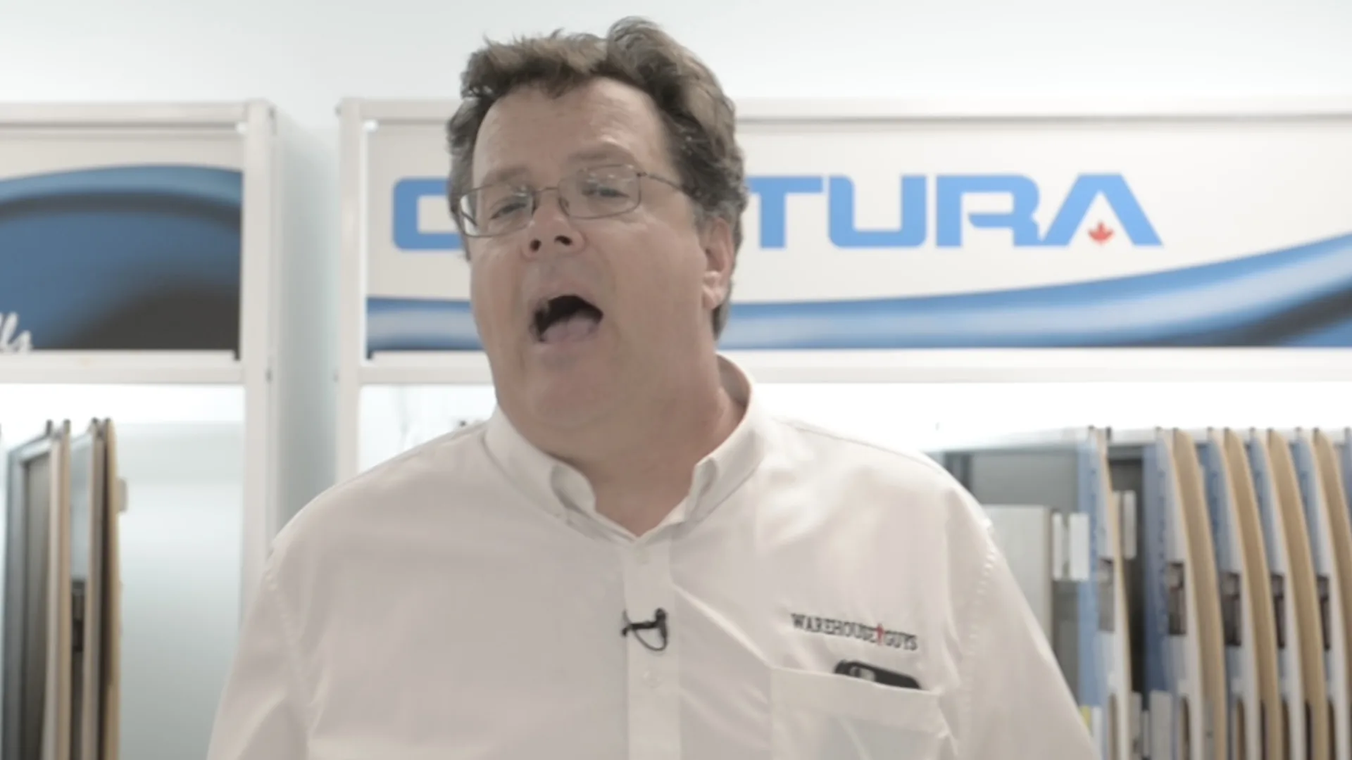
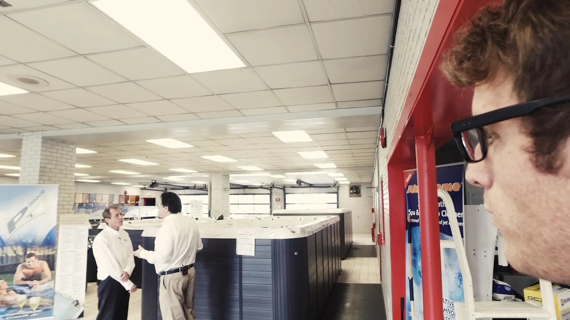
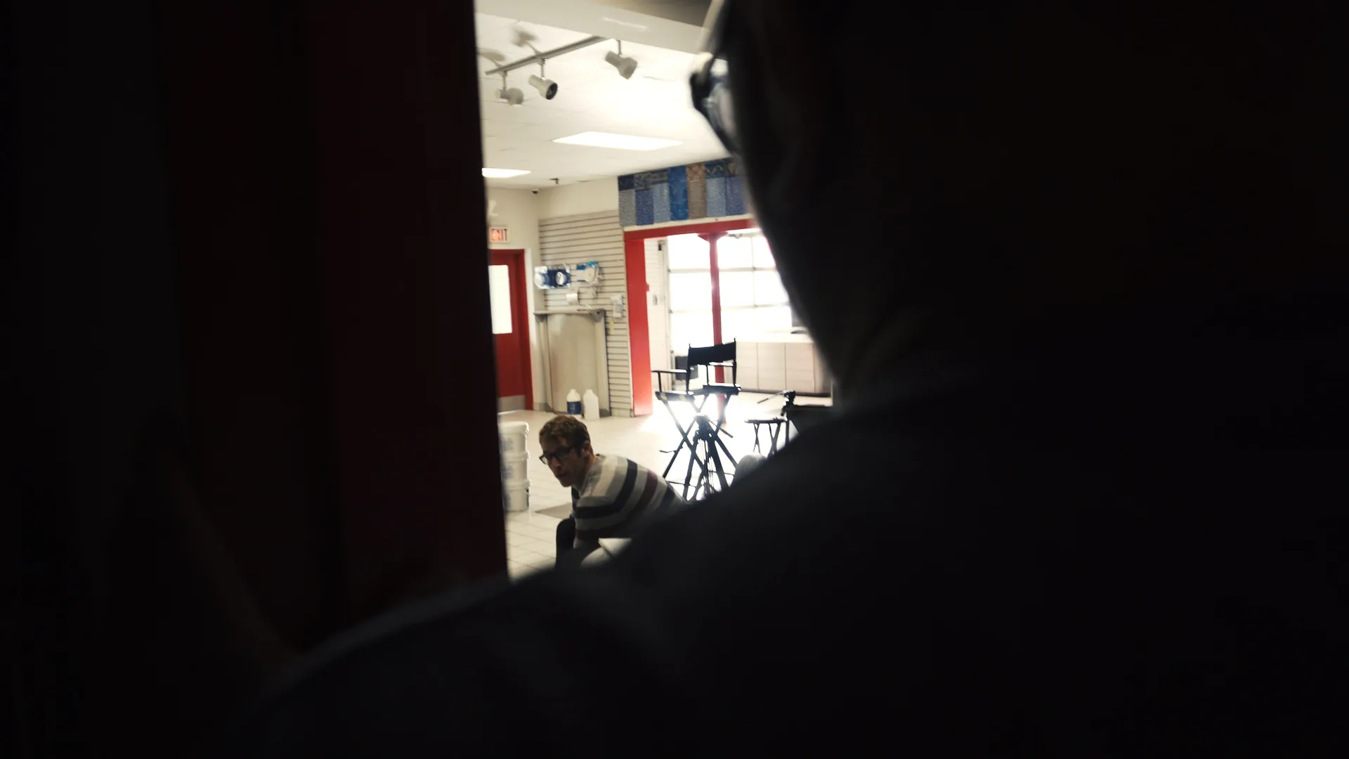
It is a ridiculous idea, which is exactly why it works. We shot it as a deadpan investigation: our on-camera team pretending to be a videography crew so they could get inside the place and shadow one of the owners, Peter Broadbent, while he tried to explain what kept happening to his prices. The owners and the staff play themselves. That is what carries it — the joke played completely straight, by people who are not actors, about a business that is real.
Seven episodes, two to three minutes each, one for every thing they sell: an introduction, then swim spas, hot tubs, floors, kitchens, bathrooms, and a finale at the pools. Same running gag in all of them, and the same interview grammar — our crew asks an earnest question, Peter answers with mounting frustration, and the mascot gets away with it again.
We shot across a summer and into the fall. Three full crew days, as I remember them, plus a run of pickups I went back and shot myself afterwards: the drone, the dark interiors, the pieces you only discover are missing in the cutting room. Rene on the A and B cameras, Derek on two cameras and a drone day of his own, an a6300, an Osmo, one long roll out of the big camera, and a separate audio recorder. The footage folders are still organised that way, by camera and by date.
The engine of the story is a price sticker. Every episode, something has been reduced overnight and nobody will admit to doing it. We bought stock artwork for a sheet of best-deal stickers and used it as a running prop, and it turns out a store's own price signs are a better plot device than anything we could have written.
Visually it is built out of the grammar of surveillance — a security keypad on a brick wall, a hand on a door handle in the dark, a man walking a showroom alone — borrowed from the news investigations the show is parodying.
What the interviews are about is true. Four men built a business out of a warehouse, worked hard at it, tried to do right by the public — and one of them says on camera that their own logo has taken on an identity of its own.
We delivered the first cut at the end of that year, and then it sat. Years later we pulled the footage back up, re-cut all seven, and put them out under our own local-news banner — The Newsload, the news outlet we run — as The Mystery of the Warehouse Guy: The Newsload Investigates. Every episode is still up, still on their own product themes, with their own people in front of the camera.
I have made a great many films that tell people what a business sells. This one did the thing the others cannot. It made the client the star of a story an audience chose to watch.
Images